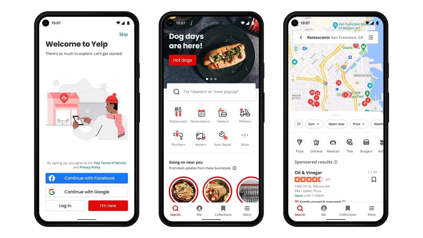
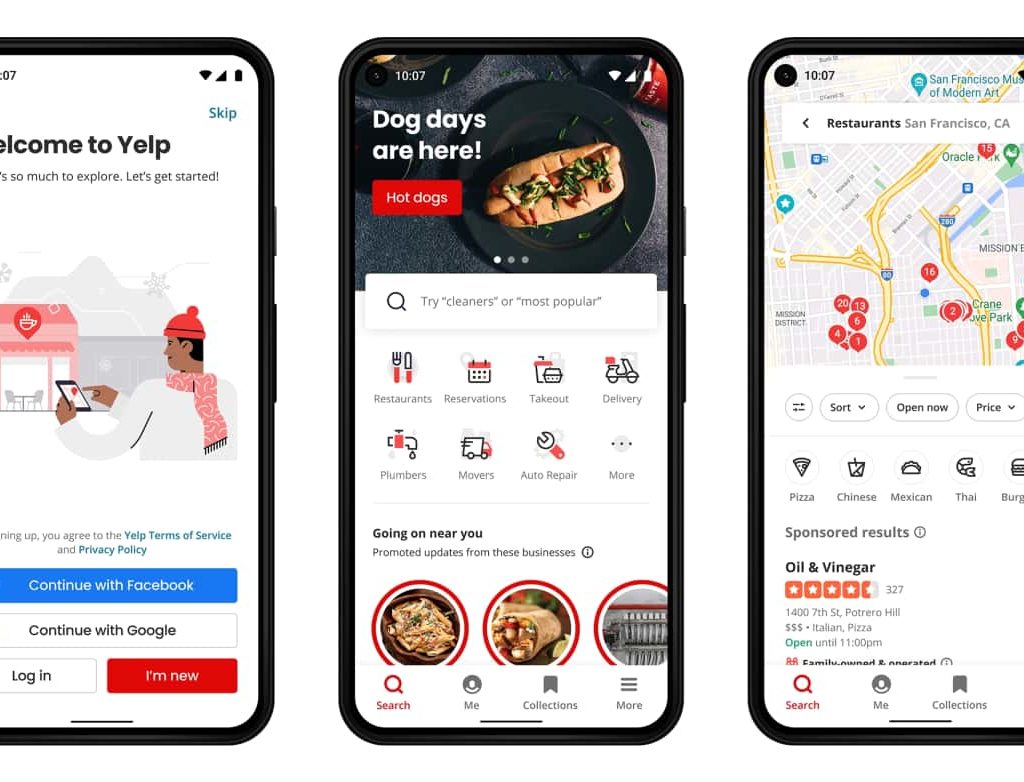
Yelp last fall launched a new mobile interface that was focused on restaurant discovery. But there was one big limitation… it was only available on iOS. This week, it extends those updates to Android devices, thereby reaching a sizable portion of the mobile population with the new UX.
Specifically, the new interface is built around a feed-based format that puts restaurant dishes front and center. In this way it sort of flips the script from a reviews and listings-forward UX to a food-forward one. This atomizes Yelp’s taxonomy to zero in on individual dishes and food tastes.
The UX redesign also notably mirrors popular feed-based formats of social apps like Instagram, where food discovery is a key part of the equation. To that end, the design language evokes “food lust.” This can hook users in for longer sessions, and help them discover SMBs that stand behind those dishes.
Moreover, the UX is aligned with the proclivities of the camera-forward gen-Z. They’ve been conditioned towards image-based feeds, versus lists and SERPs. To be clear, the new UX isn’t a replacement for Yelp’s longstanding formats, but sits beside app search and other functions as an additional option.
Yelp Launches Guest Manager to Streamline Restaurants’ Front-of-House
Subhed
Going deeper into details, the new Android UX will feature popular dishes and other trending photos from Yelp users. These include food pics and photos taken in and around restaurants. The feed will pull from Yelp’s taxonomy of tagged and uploaded photos, ranked by popularity and proximity.
This makes the feed similar to, again, Instagram and the ranking factors for its algorithmic feed. Like Yelp’s corresponding iOS update, clicking on food images bring users to more photos and reviews. If an image is more about the business(e.g., interior images), posts will link to the business page on Yelp.
There’s also now an updated map experience which brings maps more front & center. Like all the above, this accomplishes more of a visual interface, versus rows of listings. Again that’s part of a broader effort to make things more visual. This also comes after Instagram rolled out a searchable map last month.
Speaking of Instagram, there’s now more competition in local search and discovery than ever before. As Google recently admitted, younger generations are increasingly turning to places like TikTok and Instagram to discover local food & fashion. This presents a challenge to local incumbents like Yelp.
But as we examined last week, these incumbents have an algorithmic edge and lots of listings and reviews data, which are the base ingredients for local search and discovery. This will be a powerful edge over social challengers, but social connections can also add a layer of relevance to local discovery.
Volume & Frequency
Panning back, Yelp is often misperceived for a narrow focus on bars and restaurants. Though that’s what many people associate it with, Yelp has developed ample reviews and engagement in other categories. These include professional services (e.g., dentists) and home services (e.g., contractors).
That said, restaurants continue to be a key area of user engagement for Yelp. This not only goes for reviews volume but also frequency. As we discussed in a panel discussion at the recent Localogy 2022, you likely visit restaurants (Covid notwithstanding), more often than you call a plumber.
So Yelp’s latest UX update – in addition to the drivers outlined above – signals its continued commitment to restaurants as a high-value local business category. This follows recent moves including a new slate of restaurant management tools and a “front-of-the-house” restaurant management tool.
The new UX will go live in the coming weeks to Android users in 900 U.S-based cities.


