The mobile revolution is well under way. In fact, a recent report from Bank of America suggests that nine out of 10 consumers use mobile devices on a daily basis, with over a third of those consumers reporting checking devices nearly constantly. With more than half of the younger millennial cohort (18-24) saying their mobile devices are constantly in use (and a third even reporting sleeping with their device), you can bet those numbers will continue to rise.
When it comes to device use, consumers aren’t just watching funny cat videos and playing games. The latest Demandware Shopping Index confirmed what those of us who shop regularly already know: mobile is now a major factor in digital shopping growth. Consider this from the Index report:
- Mobile accounted for 94 percent of the increase in digital commerce growth, 74 percent of the growth in digital shopping basket creation, and 47 percent of growth in orders.
- Share of traffic from mobile increased by 44 percent and orders by 54 percent year-on-year.
In today’s digital landscape, and in particular following Google’s recent search algorithm changes, it’s more important than ever for small businesses to have an effective mobile SEO strategy in place. To that end, here are ten tips to get started:
1. Find your starting point.
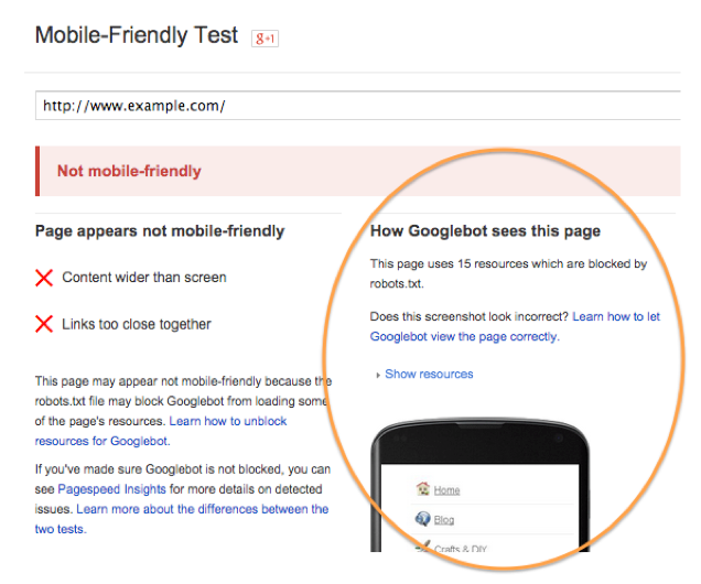
You can’t possibly reach your desired destination if you don’t know where you’re starting from. Your first step should be trying the Google Webmaster Mobile-Friendly Test, which will indicate how mobile friendly your web pages are and, most importantly, let you see how the page looks on mobile. Put yourself in the mindset of your customer: would you be happy maneuvering around your site on your smartphone? Is it easy to find the information your prospective customers seek? A great user experience is critical—make sure you’re serving that up.
2. Identify the glitches.
Review your entire site for mobile by running the Mobile Usability report in Google Webmaster Tools. This will give you a page-by-page analysis of mobile usability errors.
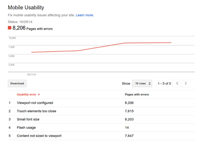
It’s only when you know what the issues are that you can start to make the changes required to get your site optimized properly for mobile.
3. Configure for mobile.
For search engines to be able to find and render a website on mobile, the site needs to be correctly configured. Google recognizes three different configurations: Responsive web design, dynamic serving, and separate URLs. Of the three configurations, it’s important to know that Google’s favored option is the first, responsive web seeding.
Responsive web design (RWD) serves all devices with the same HTML code and CSS is used to render the page according to the screen size of the mobile device being used. A responsive design makes it easier for users to share and link to content with a single URL and for Google’s crawlers to find and index content. More information on RWD can be found at Google Developers.
4. Remove any barriers.
If a site’s robot.txt file disallows Googlebot’s crawling of assets such as JavaScript, CSS, or images, it can have a negative impact on the rendering and indexing of content on mobile. Webmaster tools should be put to work to identify and correct any problems. If separate URLs are used for mobile pages, then make sure both the mobile and desktop versions are tested.
5. Don’t frustrate mobile visitors.
Mobile visitors are an impatient lot—don’t frustrate them (and negatively impact your SEO efforts) by serving up unplayable content. Some types of video are not playable on mobile due to license restrictions or software issues. This means that an expectant viewer has a poor experience if they expect to view a video and get an error message instead. To avoid this, use HTML5 standard tags for videos and animations, or appropriate video embedding to provide users with a good experience across all devices.
Other common problems that can detract from the user experience on mobile websites include:
- Faulty redirects
- Mobile only 404 pages
- Overlays such as sign-up forms or ads obscuring content
Taking steps to improve the user experience makes visitors more likely to stay on your site longer, and/or more apt to share your content with their own networks–both actions that have a positive impact on your SEO.
6. Business listings.
Local business listings can be a good way to boost SEO for brick and mortar businesses of all sizes, with Google my Business being a good starting point. Once set up, verified business information including images and reviews can appear in Google search results, in Google Maps, and on Google+. We’ll admit to bias here, but will of course mention YP℠ for business listings as another important local business listing to put at the top of your list, along with other sites like Yahoo, Bing, Facebook for Business and Yelp. It’s important to be accurate and consistent with the information registered across all listing sites.
7. Clearly visible phone number and click-to-call button.
A simple phone call can result in a quick and easy sale. Questions like “What time do you close?”, “Do you have one in stock?”, or “What is the cost of that?” can seal the deal, but not if the customer either can’t find the right number to call, or has to try and remember it after leaving your site to access their phone keypad.
This is why a click-to-call functionality on your website can be an important tool for generating business. A one button click-to-call option embedded in the mobile website, or included in ads by enabling call extensions in AdWords, makes it a simple and effective option for smartphone users. It can also be an extremely important tracking tool with regard to your lead generation efforts.
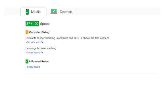
8. Don’t be slow.
As mentioned earlier, mobile users are an impatient bunch. They want information fast and won’t hang around if a web page is slow to load. Optimizing images, simplifying layouts, and removing unnecessary downloads can all improve load speeds. Using Google PageSpeed Insights can help you highlight any issues your site might have and provide suggestions as to how they can be remedied.
9. App deep-linking.
Mobile SEO doesn’t just mean making a website mobile friendly. Apps dominate time spent on mobile, a factor that is now being recognized by Google and others who are introducing app indexing into their mobile search capabilities.
Web content has traditionally been easily accessible to search engine crawlers with a well-developed and well understood hierarchy. App content, however, is often held within walls that can prove to be impenetrable to search engines that weren’t designed to unearth all of the information that your average app contains. App indexing allows the crawlers to index app content by way of deep-linking, enabling the rich content within the app to surface in mobile search results.
As a result, brands and app developers must implement app indexing in order to take advantage of the extra visibility this affords–you can find out more about the process at Google Developers App Indexing.
10. Content is key.
Last but definitely not least, is the question of content. The bottom line is that whatever you do to fine-tune to your mobile SEO efforts, if the content on your site isn’t adding value for the user, then it’s unlikely to take your efforts very far. Successive search engine algorithm updates favor relevant content that is useful to the searcher. Spammy linking tactics and keyword stuffing tactics are thankfully a thing of the past.
Whether on desktop, tablet, or mobile, content needs to solve a problem, fulfill a need, or create a sense of purpose for the reader. Publishing content just for the sake of it, is unlikely to offer any value for your target audience, or for you, so keep that in mind as you fine-tune your content strategy. Good quality content is the foundation upon which your mobile SEO strategy is built.
Mobile is a game-changer for brands, businesses, and marketers, as the use of smartphones and other mobile devices continues to explode. The key to success is knowing what it takes to provide a great user experience and serve them up content that gives them what they want when they want it. Your customers are waiting, with devices in hand–the time to embrace mobile SEO is now.
NOTE: All graphics from Google Webmasters/Google Developers